New video time! This week I wanted to share with you how to use the PaperArtsy Infusions with Versamark.
If you haven't yet come across them, PaperArtsy Infusions are a water-soluble powdered pigment mixed with walnut crystals. Sprinkle them on a surface and add water, or a medium, and they develop into intense colour, then a few seconds later the walnut crystals also dissolve to give a different texture to the colour. There are lots of different ways to use them and you can get lots of interesting and different effects with them. So how about using them with embossing inks?
If you are a seasoned stamper then you will have used embossing inks before, they are slow drying, clear inks and tend to be tacky to the touch so that they can hold embossing powder. You might also find them referred to as watermark or resist inks too. Various different companies have their own version of this ink and the one I am using it VersaMark ink but feel free to try out what you already have to hand for this technique.
VIDEO: PaperArtsy Infusions Meet Embossing Ink
In the video I am sharing two ideas for how to use the PaperArtsy Infusions and VersaMark together: stamping and using them with a stencil or mask.
[I do use affiliate links and there are some in this blog post.]
Products:
PaperArtsy Infusions: Royal Blood, Golden Sands: (UK) That's Crafty; (US) Simon Says Stamp
Tsukineko VersaMark ink pad: (UK) Amazon; (US) Blitsy
PaperArtsy Eclectica³ {Kim Dellow} Stamps EKD03: (UK) That's Crafty; (US) Simon Says Stamp
The Crafter's Workshop template - Mini Pebbles Tied - TCW595: (UK) Amazon; (US) Blitsy
Watercolour paper Bockingford CP: (UK) Amazon; Alternatively try Fluid CP: (US) Blitsy
Spray bottle water
Acrylic block
You can also try this technique with other water-soluble powered pigments. I have tried this technique with the Ken Oliver Color Burst powders and when I find my Brushos I will try them too! They are hiding from me at the moment! *Sigh*
I personally preferred the PaperArtsy Infusions, particularly with the stamping technique, as I think the powder/ particle size might be lightly bigger in the Infusions and so I can get the stamped image to stand out more with the Infusions than with the Ken Oliver Color Burst. But then it is probably down to personal preference and the effect you are trying to achieve, so have a play and let me know what you think!
But one of the great things about using the water-soluble powdered pigments is the fabulous texture that they can give you and I think using them with the embossing ink really does play well to this strength.
I am looking forward to seeing all your makes using these techniques so do give me a shout if you use them.
I've been adding videos to my YouTube channel so if you want to see them there first, or just to be able to see them all in one place, then don't forget to subscribe to my channel Kim Dellow and turn on the notifications in your settings!
Come And Connect With Me:
YouTube
Instagram
My Shop
Join My Newsletter!
Facebook
Pinterest
Twitter
Showing posts with label Tips and Tricks. Show all posts
Showing posts with label Tips and Tricks. Show all posts
Wednesday, 17 August 2016
Tuesday, 7 July 2015
Behind The Scenes Tips From Wonderful Wall Art Creative Stamping
Have you seen the wonderful Summer Collection stamps that come with the current issue of Creative Stamping yet? When I first saw these stamps I was immediately transported to summer holidays and bright colours.
I don't know if I am allowed to have favourites from the set but I really love the flamingo stamp (flamingos are SO hot right now!) and the bird of paradise. I mean the rest of the stamps are pretty gorgeous too but those popped out first for me.
My article was all mixed media wall art inspiration using the collection and you can see all the details and projects in Creative Stamping Issue 25. But I do have a picture that didn't make it into the magazine just for YOU.
It is a little peak into how I set about designing the Bird of Paradise project from the article and a couple of handy tips for your projects:
1. Mock It Up!
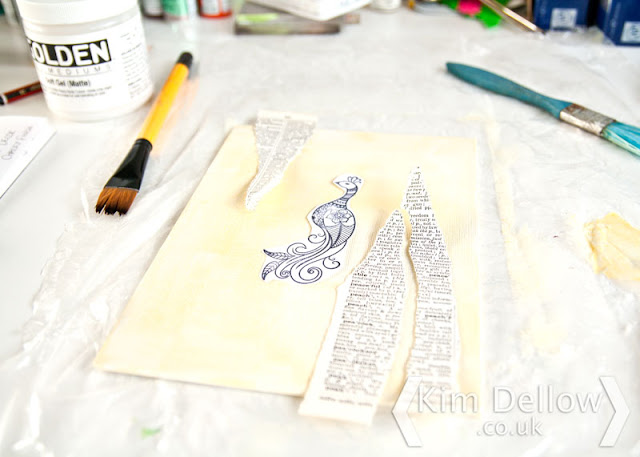
I often mock up my makes before glueing down to give me an idea about placement of the elements. I use the items themselves or, like in the case of the stamped bird, I stamp it on spare paper, roughly cut it out and use it to help decide where things need to go.
2. Don't Freak Out!
Later in the process I stamped the bird of paradise on the canvas board then proceeded to cover it up with paint. It can be a bit scary to do this. But don't freak out about losing all the lovely stamp details. You will lose a bit of the detail but you will also add a bit of your own details that will make the final project unique to you.
Two general rules of thumb that can be applied to a lot of situations really, I use them a lot. For pictures of the finished wall art and instructions on how to make them check Creative Stamping 25 and when you do come back and give me a shout as to which of the stamps from the Summer Collection are your favourites!
Kim

Sunday, 5 July 2015
How Do You Start A Clean Sketch Book Or Art Journal?
Ok, so you have a lovely new art journal / sketch book / notebook and it is all shiny and new, you don't want to touch it, right? Don't tell me you don't know what I'm talking about because I KNOW you do!
Well you need some quick, go-to exercises to help you break into that lovely new book don't you?

I'm sharing three of my favourite tips on the Blitsy Blog today and I would just love it if you popped over, had a look then shared your favourite tricks below the post, I'm so interested to see what everyone does! Thanks!
Also if you go over to Blitsy now they have 60% off any one regular price item to celebrate the 4th of July. So the next question is, what are you gonna buy?!
Catch you later Art-inators
Kim

ps. I do use affiliated links for my blog but only to things I buy myself and from shops that I love. There are some affiliated links in this blog post and if you want to know more about my affiliate policies then check out my Disclosures and Disclaimers.
Well you need some quick, go-to exercises to help you break into that lovely new book don't you?

Also if you go over to Blitsy now they have 60% off any one regular price item to celebrate the 4th of July. So the next question is, what are you gonna buy?!
Catch you later Art-inators
Kim

ps. I do use affiliated links for my blog but only to things I buy myself and from shops that I love. There are some affiliated links in this blog post and if you want to know more about my affiliate policies then check out my Disclosures and Disclaimers.
Thursday, 3 January 2013
Welcome 2013 - Organising Colour
I was doing a bit of colour admin for the start of the New Year and I thought I would share a couple of my current favourite organisation tips in a hope that you might share some of your favourites and also to start the New Year as we mean to go on. It must be that New Year feeling where all is fresh and you are inspired to get things sorted once and for all? Do you know what I mean?
So the colour admin I was doing was to decorate the cover of my new colour reference book:
When ever I get some new colouring materials I put little scribbles of them in an A5 notebook, it is one of the Seawhite starter sketchbooks and you can usually pick them up cheaply in art shops. I've even seen them online and if I remember where I will add a link at the bottom of this post. I get mine from Cass Art in case you happen to be in London.
It is a fun little exercise that only takes a couple of minutes and can be done in front of the telly or at your work desk to help ease you into work if you are feeling a little mojo-lacking.
It is also great for starting to work out how the colours work, feel, look and play together.
I also like to write the names of the colours down and I'm finding that this exercise is helping me to recognise and spot colours in a different way which helps when I'm working, or even just out and about spotting new colour combos I want to play with. So a good habit to get into for 2013 if you don't do it already!
My next tip is a similar sort of thing and another way I organise my colour, this time I mainly use it for my sprays and inkpads/ reinkers.
I use little strips of cards around 4cm by 2cm and punch a hole in the top for some binding rings. I then spray or add droplets or swipe the colour onto the strip and write the brand and name on the back.
Each ring is a different type or brand of colour and they hang from my workdesk lamp for quick reference.
I find that the rings and colour books are easy to grab and a great way to find what you need or inspire some work when you are feeling a bit lost.
Do you do this? How do you organise your colour? I would love to know.
Happy 2013 to you and wishing you lots of creativity for the year ahead!
Kim
[EDIT: Artist Trading Post has some of the A5 notebooks and the A4 notebooks too.]

Subscribe to:
Posts (Atom)


