If you cast you mind back to last Thursday, all those days ago, before the weekend and everything, you might remember that I'm taking part in a competition being sponsored by Cox & Kings. Myself and four other artist / bloggers have been asked to make something inspired by the Cox & Kings Morocco Tours. We all got to choose a photograph to take as our inspiration and here is the one I chose...
[Photograph from Cox & Kings]
I wasn't really sure what to make, but then it hit me, what do artists need when they travel? A travel journal of course!
I was very glad I had a photo with Moroccan tiles, so I thought I would try to reproduce them in my make.
I used a French Link stitch to bind the journal, which was fun as I hadn't used that particular binding before.
The signatures are made up of a range of different papers so there is lots of choice for sketching, painting, journalling in this travel journal. You can pop photos in it too and there is a folder in the back to store all your travel ephemera.
[There are some affiliate links in this blog post, so if you buy through them I do get a small amount of money at no extra cost to yourself. Thanks for your support!]
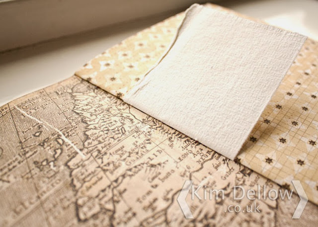
I even found some paper in my stash that had a map of Morocco too!
If you don't want to know how I put the cover together then skip down to the bottom now to check out the websites of my fellow participants.
The cover is a mixed media piece. I thought I would do a little experiment, I've been meaning to try designing some stencils and masks with software to then cut with the Silhouette Cameo, so this seemed like a perfect opportunity to give it a go.
I started in Photoshop Elements with my inspiration photograph and selected the elements that I wanted in the tile portion of the photograph.
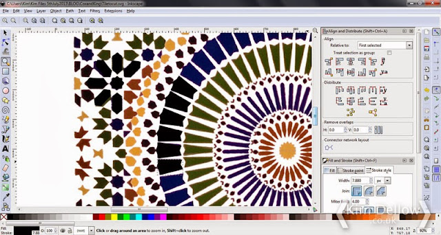
I also changed some of the elements to get a full tile and to add a bit more symmetry in the places where the picture wasn't complete. Once I had my new tile I opened the file in Inkscape.
As you can imagine, working from a photograph in Photoshop meant that the elements of the tile were quite pixelated and I used Inskape to clean up the edges of the shapes so that I could then use the file to create a cutting file in Silhouette Studio.
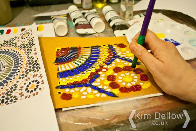
I then used the cutting file to cut a mask from oil-coated card which I then used to paint the tile onto the cover with acrylic paint.
I had already prepared the cover with a collage of paper printed with my Thursday blog post translated into Arabic with Google Translate, fixed and then painted with Gesso.
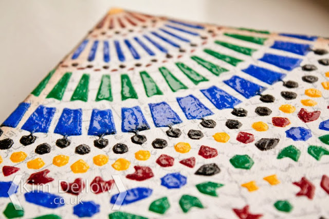
Once I finished the stenciling I used the mask again to put a layer of clear texture paste over the pattern to give it the look of tiles and a bit of dimension, then lightly distressed the edges of the covers to bring the whole book together.
It was a great learning process and a big thank you to Cox & Kings for the inspiration and motivation to try out my little experiment!
Going by their blogs I know that the other guys, Vandy Massey, Jenny Keal, Concetta Perôt and Alan Reed, will have some amazing and different pieces to show you and I am looking forward to seeing what everyone has done. So pop on over to their websites to take a peek.
Thanks for popping by.
Kim


